Microsoft wants to teach developers the tips and tricks of designing apps for Windows 10
![]() 3 min. read
3 min. read
![]() Published on
Published on
Share this article

Read our disclosure page to find out how can you help Windows Report sustain the editorial team Read more
With Microsoft’s developer conference right around the corner starting March 30th, 2016, the company is trying to get out ahead of API and code talk with a new series dedicated to designing. In what the company is calling “the first in a multi-part series,” Microsoft is introducing tips, tricks and design principles for crafting unique and, more important, successful apps in the Windows Store.
The new series of blog posts can be found at Building Apps for Windows, and the first installment is a lengthy one that looks to cover the demystifying design, what content to focus on while designing an app, understanding customers, and much more.
Other useful tidbits from the blog also include advice on quickly iterating an app and its design.
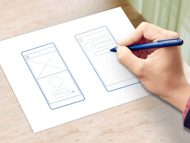
Mock up different screen designs based on your customer feedback, either as sketches or wireframes and imagine the workflow that customers will go through to accomplish their tasks. You can use whatever method works best for you to create these prototypes. If it’s faster for you to do rough interface designs in Visual Studio or Blend, use these tools. But note that you don’t need specialized software for this process, nor do you need to be able to draw. Notecards and sketchpads are just fine.
Even better, you can sketch your app design on sticky notes. This way you can easily move screen elements around to see how they look — and, more importantly, quickly put them back if things don’t work out the way you expect.
If you aren’t sure what to try first, take a look at apps that are similar to yours, then see how the workflow might look for your app.
Now try moving screen elements around. If you started with top navigation, you can try left navigation instead. If you have a large header with text, try moving it to the bottom. Buttons and content panels can go just about anywhere. Move them around. Switch out buttons with text; switch out text with links. Experiment. Iterate through this process for every screen until your gut tells you that you’ve gotten your layout to where it needs to be.”
Microsoft has its work cut out for itself this month as it tries to thread together a story around its UWP platform that can entice once-lost and current Windows developers to come along for the ride. Getting developers excited about the design of an app and explaining how user interface leads to user engagement seems like a solid beginning.
Interested in Microsoft’s UWP platform or creating for one of the company’s other platforms such as Xbox, Office, or Cloud? If so, head over to the Building Apps for Windows section of the Windows Blog to catch the first installment of app design walkthroughs.